Game Design 2: GUI & HUD

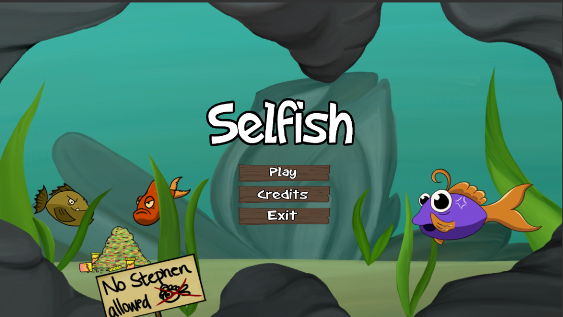
The last 2 weeks, I have been working on finalizing the GUI (Graphical User Interface) and HUD (Heads-Up Display) for the game my team has been working on (Shelfish). When it came to the main menu I had an idea from the start, I wanted to use wooden blanks for the button background, in addition to sticking to the design theme by making cartoonish text with still an element of humor. For the planks, I simply started sketching different types, since I had little to no clue how detailed my group wanted the planks to be. I wanted to create somewhat worn looking planks, but not too the point that they have been in water for so long that seaweed or fungi would start to form around the edges, I decided to keep it simple. Therefore, in the end it was a mutual decision since the overall designs of the game are not overly detailed, the planks should remain simple, to compliment the background, and not to take away attention from it.

As for the overall text of the game, I wanted it to be stylized and cartoony, hence the thick outlines. While I still wanted it to be playful, so I sketched around with a few ideas, and ultimately, chose the one that suited the game. Although, for some things like the wave counter, pause menu and the game over scene that font was not used and instead I adjusted the font to fit the scene and what it was supposed to be used for. Which, in this case was a more static, bold looking font, that stood out more and in a way indicated that it was more “important” than for example the button text, in the sense that it was something that had occurred or an event.

Logo Design - Selfish

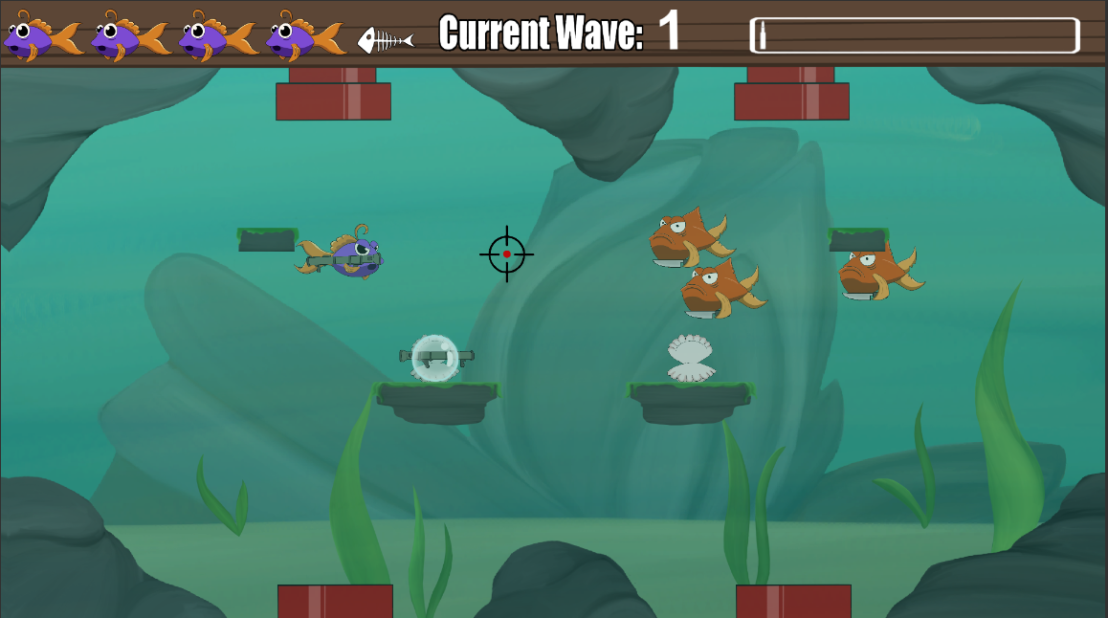
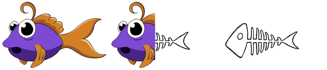
The HUD on the other hand was another matter entirely, I struggled to come up with an idea that I liked. My first thought was doing a simple and yet very recognizable representation of health in games (hearts), it was straightforward, cartoony and it would work, but I wanted to come up with something better. I then got the idea to have a fish and its skeleton to represent the player’s health, so I started drawing a cartoonlike fish and a skeleton to match so that it would fit well in the game. Although, when I saw the result, the health display looked good, but it did not fit with the overall game. The fish was not stylized enough, and as a player I would be confused if I saw a fish that looked nothing like the other fish in the game, especially from a child’s point of view. This was one of the things that bugged me a lot, and then I realized that I could have just used the fish that my teammate Mikaela did, and use that. The solution was very simple and right in front of me from the start, which was a bit frustrating after doing all that work but on the other hand I got to experiment a bit.

Since I knew exactly what I had to do, and even had a skeleton to work with, I used the transform tool in Photoshop, and minimized, molded and made the skeleton fit with the player sprite (Stephen). Although this did not work perfectly since the graphics got a bit messed up, I made a new layer and redid some things that worked, and changed those that did not to get the final result that I wanted.

Sample

Skärmbild (29)

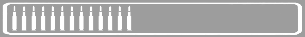
When it came to the ammo counter, I had a few ideas, but I was not sure if they would work or how it would look since one of the weapons (our AK-47) has 30 rounds of ammunition. The first idea I had was to take the attack projectiles for each weapon we had in the game, go into Photoshop, take the original ammo and lower the opacity, save it under a different name and then make a sprite sheet out of it. It would be easily to recognize what ammo belonged to which weapon but it would also overly complicate things and might not necessarily fit in the HUD.

Bazooka Sprite Sheet 1.png

In the end, I went with a suggestion my group’s designer Ludvig came up with, which was to make a simple bar, that contained bullets representing the ammunition used in the game. Therefore, I took the attack projectile I had made for the AK-47, changed the color into something neutral and stayed away from red to not confuse the player (red is usually a color that represents health). I decided to add a bar around the bullets, and made sure that the maximum amount of bullets (30) would fit with the ammo bar.

dfgdfg.png

For the crosshair, we wanted to keep it simple and cartoony and not overly complicating it with eccentric details, so I simply drew a circle, added a dot in the middle and drew some lines going towards the dot in the middle. Although I had no clue what colors would work, in addition to not clashing with the background. Which is why I made several different options so that they could all be tested out and we could see which would work best.

In the end, I learned a lot and was able to experiment to see what would fit the style of our game best, which in the end was to keep it simple, stylized and cartoonlike. At the moment, I would not want to change a single thing, everything that bothered me or did not fit, I have already changed. In that sense, I can honestly say that I am happy with what I have designed, and that most importantly, that it all suits the overall game and design without anything clashing.

Skärmbild (34)17200584_1353199318079853_1682692668_o


Game Design 2: Explosion Animation

Last week, I worked on creating a explosion for when the bazooka would either hit an in-game object like for example, a platform or rock,or the in-game enemies. Since the bazooka is used to take out numerous enemies at once, we thought an explosion would help communicate to the player that the enemies are being hit with a certain amount of force, hence the explosion.

I started by making a few sketches on how the explosion could look, while keeping in mind that the design should lean more towards a cartoon like design. Which meant thicker outlines, more exaggerated features and less intricate details overall. I wanted to make more of a pointy explosion, resembling more of a typical chat bubble in a comic book but without the “BAM!”, and adding a smaller one on the inside so that I could play around with the colors and so it would give the explosion depth rather than just a point edged “circle”. After that I made a simple cartoonish cloud, and around it the same point edges I had used in the previous sketch. Nevertheless, I was still not happy with how it looked and I felt like something was missing, so I decided to combine the two previous sketches into my third sketch, which became the explosion I decided to develop on further.

explosion-sketches


The colors I chose are very typical examples of how an explosion in a cartoon would be colored, or even in a comic book, in addition to the fact that yellow and orange match very well together. Although I didn’t think that way at all while I was coloring and only kept in mind what I knew from how explosions were depicted in cartoons color wise, yellow, orange and red being the primary colors of almost all cartoon explosions.

3

When it came to the actual animation, I simply had to use the transform tool in Photoshop to minimize the explosion each time which in this case was twice, since I decided to only have three frames to create a quick and simple explosion. Each smaller explosion was placed in the middle of the previous explosion to avoid having a hacky animation. When I first saw the animation, I thought it worked surprisingly well but I still felt like something could be improved, so I went back to my second frame, tweaked around with the color contrast and made it darker and gave the cloud more of a reddish hue.

Ultimately, this was good way for me to get a better understanding of what goes into creating animations, even if they happen to be “simple”, I learned more about where to place the animations to prevent it from looking hacky, and that small color differences in the different frames can change the animation for the better and give it the feeling of being more alive or at the very least giving some depth to the animation itself.

animation-explosion

Game Design 2: Bubble Sprite

Two weeks ago, I worked on creating a bubble sprite to be able to create a particle trail in Unity. Which makes it so that our protagonist Stephen leaves a trail of bubbles after him as he moves around inside of the screen, to give more of a life feel to the tank. Like with most things on working with this project, I had no previous experience in making a bubble sprite, or even drawing a bubble. Which led me to seek inspiration online, and I shortly realized that there were so many ways I could draw and tons of techniques that I could use to make a bubble sprite. I began by drawing a simple round circle, in a light shade of blue/green, in addition to adding two simple white dots in the top right corner. Although it did not end up looking quite right, so I began to “stretch” out and expand one of the bubbles while still following the edges of the bubble, to make it seem like light was reflecting on the bubble surface. Which seemed to fix the problem, and made a big difference, in addition to resembling a more realistic bubble. Even though I wanted to have more of a cartoon like feel, it still worked since I made sure throughout making this game that the design assets kept a hint of realism, to not make the game look too cartoonish and too directed towards children aesthetically wise when the target audience includes both children and teenagers. To finalize this bubble sprite, I wanted to go in and make it more natural and detailed, by shading around the edges lightly in white. The further away I got from the edges and the closer I got to the middle of the bubble, the shading would get lighter and would start to fade away.

Ultimately, I thought it was going to be easier than I originally thought and even though my explanation sounds quite simple, I struggled a bit with the shading. Often, I ended up putting too much pressure on the pen and the shading became more intense in places where it was supposed to be the opposite. In that sense, it was more of an annoyance than a struggle, but it worked out and the bubble sprite ended up exactly how I imagined, in addition to working perfectly in the game, both as a particle trail and indicator around the power ups.

Skärmbild (18).png


Game Design 2: Designing a treasure chest

Originally, we had planned to make a game which had the camera following the player vertically through the game level. Therefore, I decided to draw some decorative and possibly interactable objects for the game, which in this case was a treasure chest. A treasure chest is something that can be commonly found as a decorative object in fish tanks, which is where the game is played out in. In addition to the fact that I figured that it would fit the game background, and possibly act as a hiding place for Stephen or act as a place for the power ups to spawn for the game level.

At the start, I had a somewhat good idea of how I wanted things to look, but as I had never drawn a chest before I did a lot of research, looking at several different treasure chests, both realistic and cartoon ones to get an overall sense of what I could draw. I started with drawing a few sketches of treasure chests, and wanted to keep it being quite cartoon like, with still a hint of realism until I found a sketch I liked, and fit the art style of the game. I drew a typical example of a chest, with round edges and a less rough look in the sense that the edges are a lighter and yet somewhat rounded, while at the same time sharp. When it came to some more decorative details of the chest, such as the jewels and the coins, I decided to make very simple sketches of coins, and add them here in there, rather than draw every single coin. This approach gave the sketch of the overall treasure chest a cleaner look, and gave the illusion that the chest was filled with coins, without having to draw every single coin. The last remaining details was adding some jewels to the chest, and I decided to draw two rings in two different places, which had a very simple 3-dimensional diamond shape, with a flat surface, to not just have the chest filled with coins, and to add some color to the treasure chest. In addition to a simple row of pearls on the in outside of the chest to give the illusion that the chest is overflowing. After that I simply cleaned up the lines, to get a clearer, more stylized look of the treasure chest. After that, all that was left was to color the treasure chest, and some minor design details to add shine to the jewels in the chest. When it came to the actual coloring, I chose very realistic colors, since I wanted a more realistic feel for the game. For the chest, I chose to color it with a simple darker shade of brown, and to highlight the sides and edges of the chest with a lighter shade of the same color. Brown being one of the most typical colors used to color chests. The pearls were colored in white, as I thought it would fit, and because white is a typical color that pearls have. Which goes back to me wanting to stay realistic when it came to the coloring of the in game assets. The coins were colored in a simple shade of yellow, not too bright, and not too dark. The jewels were colored in two different colors to add a bit more color to the object itself, and simply because I wanted to explore, in addition to play around with making a somewhat shiny/matt texture with two different colors.

Ultimately, I still want to add more details and possibly change some of the colors, to make for example the coins itself more distinctive for the rest of the pile. In addition to add more details, to the jewels to make them shine, and reflect light. I am quite happy with the result, but since I am a perfectionist I am never truly done and always find new things that I want to alter, change or even add. Although through drawing this game asset I have been able to work more on my color textures through making the jewels, and by drawing new things like the chest, and succeeding in what I wanted to achieve.