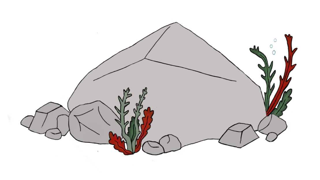
By looking at several different pictures online about rocks, both cartoon rocks and actual rocks, I got a good understanding of how I wanted it all to look in the game. Although, rocks were nothing I had ever drawn before, making it a bit difficult for me to know where to start or even what to start with. Basically, I started drawing a big “blob”, in addition to later spreading it out and making it lean more towards a triangle shape but with more rounded edges. At the moment, it did not look like anything particular and I struggled to see how this would look like a rock in the end. After I started adding more lines to the top, and defining the edges a bit more, in addition to making it at least somewhat resemble a more “3-Dimensional shape” to give it more of a realistic feel, I could start seeing a rock on my screen. Thereafter, I added smaller rocks, but this time instead of drawing all the rocks as small “blobs” I drew a few of them as small squares and triangles, and worked my way from there until I was happy with the shapes and lines. From the start, I had already planned to draw a couple of rocks and add some seaweed here and there, so then again, I went back to the drawing board, researched until I knew what sort of seaweed I wanted to draw and drew a couple of sketches of some different designs of seaweed. In the end, the thicker, bolder lines gave a more cartoon like feel and was ultimately the design I went with and the one that fits with the design of the other assets in the game. When it came down to the coloring I had a few different ideas on how things might look, I tried first coloring with a more reddish brown color for the rocks (both big and small) but that ended up looking unrealistic and clashing with the seaweed colors in a bad way by toning down the colors, in addition to not fitting well together or the game background. As for the seaweed, I wanted to go with more realistic colors and figured that red and green worked quite nicely together, and ended up adding a lighter shade of the colors on the inside, and a darker shade on the edges to bring out the color more, drawing your eyes in.
Ultimately, most if not all of my design decisions were based on the kind of game design that we wanted to have which was leaning more towards a cartoon like feel with a hint of realism. At times, I struggled making certain assets look more cartoon like but then I realized that making the outlines thicker and rounding up the edges a bit more seemed to do the trick and in the end, this was the result.
Continue reading “Game Design 2: Designing a Cartoon like rock”
